Thursday 25 August 2011

I'm a photographer...

Bit of a catch up post as haven't found the time (it's the summer holidays.. I've been busy!) to sit at my computer and blog. Received my results, I got a distinction, collected my portfolio and have propped it up against a wall to gather dust... Feel a little sad that it's all over and am now eager to embark upon a new adventure: I have the learning bug and don't think I will ever be free of it! Took some photos for the Magg's Day Centre the other day. Was a very scary experience but have learnt so much from it. Had to produce a poster to attract subjects and model release form to put things on a more official standing. These things take time and I think in the future I will have to start figuring these in the costings! Spent the day prior to the shoot taking test shots and working out good locations, weather was lovely and came away full of inspiration. Day of shoot arrived, typically overcast and weather forecast ominous, subjects didn't want to venture further than the front door! Felt a little nervous to start with but soon put this aside and just enjoyed having a natter. I think I would have struggled if I'd been alone, was good to have an extra pair of hands when it came to getting forms signed and thinking on the hop about how I could make one location look like several different ones! Also the subjects were not of the sit and pose for multiple shots variety... Took two shots max of each subject (and second one was often given grudgingly!) thank god it was drilled into us on our course to think and compose before firing the shutter - I didn't get any second chances! Was aware from the outset that the client wanted a particular look for the images and tried to accomodate this but think I probably snuck a bit of me in there too! I'm not sure I'll always be able to equate what I want to achieve with client demands! Sticking one guy behind iron railings felt wrong to me, client liked this one, getting them to smile felt right! Read an interesting article published by jpeg magazine which offers advice to aspiring photographers. Couple of things I took from it: firstly learn to say no if a job doesn't fit you, I think this one did - I like portraits and love B&W but the one I've just been offered doesn't and secondly learn to say "I'm a photographer" out loud with a straight face! Read the article you'll understand!


Saturday 25 June 2011

Conclusion: Assignment Reflection

Of all the assignments I feel this one really suited me the most. Will dwell on the positives first! This assignment brief really encouraged me to break free of photoshop and look at creating images using a more hands-on approach. I like using photoshop, have continued to use it for the duration, but I really wanted to try creating artistic imagery without it. Because I utilised film cameras leading up to the 'Time' Project I wanted to branch off in a different direction for this assignment. I was aware that the assignment brief demanded a certain amount of darkroom experimentation but in order to make the most of this experience I didn't want to repeat methods I had already explored. During lessons I was able to play with pinhole cameras (mixed results!) and paint with tints. I had a lot of fun with the photocopier and this featured very strongly in my final images for this project: the roses and hand-written text in the bath image, the pouring water in the portrait. I also looked at methods I could easily play with off site. I produced a series of images using a Polaroid camera and out of date film and many images using light sensitive paper. I also created digital negatives from some of my images and used these to create contact prints, both on light sensitive paper and in the darkroom. I did re-visit some techniques I had used before: TTV photography and in-camera techniques such as slow shutter speeds to create blur. On to the negatives... If I'm honest I'm not entirely sure that the images I produced are that great! I had a lot of fun during the process but I don't look at any of them and feel any particular sense of satisfaction. For me this assignment has been more about experimenting and looking at different ways of producing images, it has encouraged me to move outside of my comfort zone and go a little wild - from that perspective I am really happy! Would I change anything? absolutely not. I feel I managed to explore quite a few new techniques in a very short amount of time. I also feel that these are techniques I would use again. I think after my inital elation at the prospect of a project with such an inviting title 'fantasy landscapes' I went through a slightly despondent phase when I realised everyone else seemed to interpret that as meaning cut and paste in photoshop... I started this course because I found myself using photoshop way too much! I think I may have stretched the brief in some regards, few of my images are landscapes, but they are fantastical in that nothing in them is real... am very pleased that in the main I managed to create this using a camera,scanner or processing and not software!

Experimentation: Darkroom prints from digital negatives

Last practical evening at college so took the opportunity to use the darkroom one last time. Thought it would be interesting to see the results of contact prints made from the digital negatives I had created. Have already recorded the actual process of creating contact prints in my sketch books so won't bother regurgitating that here, also put the best prints straight into my portfolio (handed in for assessment) so unable to upload the best results! Happiest with the feather image because the texture in the image really came across, less pleased with the portrait as I felt a lot of the detail was lost - interesting that this seemed to work much better with the contact print using light sensitive paper.


Monday 13 June 2011

Experimentation: Polaroid triptychs

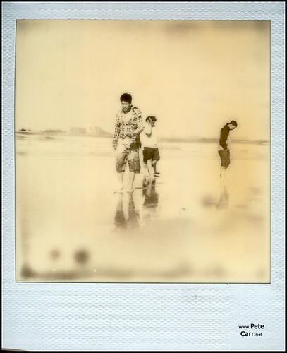
Finally got around to testing the out of date film (exp: Jan 2005) that I got with my Polaroid camera. Worked surprisingly well! Was half expecting the developer to fail and to end up with half-developed prints (on reflection I would have quite liked it if it had!) but the only real issue was the noticeable colour cast and slight lack of contrast. Decided not to alter this in photoshop as the overall effect is quite distinctive and totally in keeping with the format. I did try scratching one of the images, read a lot about manipulating images as the emulsion was drying, but the results were unimpressive. I think this would work better with images that have a broader colour range. Scanning added its own complications as this resulted in overly bright yellow prints... tried to capture the original look as much as possible but I def' have issues with my monitor (never calibrate yourself you'll only make matters worse!) and am now convinced they have a rather unsavoury green cast to them. Anyway these are the results, have ordered a couple of prints to see what they look like...

I took the first two images in this set and my other half took the one of me (hence lopping off my feet and rather nice shadow!) Quite like the fact that the one sits slightly lower in the frame so have duly forgiven him...


This one was a mistake! I took the chair image and flipped it to create a wallpaper background to set off the polaroids. Then, whilst tidying up the polaroid frame, accidentally deleted the central image. Rather liked it so saved as a seperate file.


Because the actual polaroid image is quite small I decided to present them as triptychs. Think they work quite nicely in threes. In this last one I tried to tell a bit of a story... kind of self explanatory - plastic poundland bunny gets noshed by fake fur critter!


Tuesday 7 June 2011

Experimentation: Cyanotypes from Digital Negatives

Had half an hour to kill when I got back from work today so thought I'd make the most of the momentary sunshine and quickly develop some prints from the digital negatives I made the other day. Same process as before. Stored the sun-print paper in my changing bag, until I was ready to use it, then placed a digital negative directly onto the surface. Placed a piece of perspex on top to keep the image in place and left for 2 minutes (not quite as sunny!) to expose. I then removed the negative and placed the sun-paper in a bowl of water. Transferred to a towel to dry. Am really surprised at how well these came out! There was a lot more detail in the figures than I was expecting. Now I just need to work out how I'm actually going to utilise this technique in a fantasy landscape image..


Sunday 5 June 2011

Experimentation: Digital Negatives

To make my own digital negatives I ‘followed’ the instructions given on this site. I selected four of the images I have been working on recently, converted to black and white and then tweaked the settings slightly to maximise contrast. I then used the invert tool to achieve a negative image. Found the print settings on my printer somewhat difficult to negotiate – certainly share no similarities with the settings given on the website. Did my best to select the correct options: increase density etc then printed onto inkjet transparency film. Looking at the results I suspect the feather will work best as a contact print. I’ve been unable to test this out yet as typically the weather is now overcast and cloudy so I have no sunlight to develop with! Back to work tomorrow, so playtime is essentially over, and I still don’t have an image I’m entirely happy with… starting to feel somewhat gloomy about this project again… would be nice to finish on a high!


Experimentation: Cyanotypes

The light sensitive paper arrived Saturday morning and seeing as the weather was suitably obliging, fabulously sunny day, I was able to play with it straight away. To start with I tried using some glass negatives to make contact prints. I popped the paper in a film changing bag to protect it from light, cut a piece of foam to place the paper on (instructions said use corrugated card but I didn’t have any!) and filled a bowl of water to use as a ‘development’ tank. The instructions suggested a two minute exposure but the sun was so strong the paper was bleached white in only twenty seconds! I tweaked to accommodate this and then placed the paper in the water for one minute to wash off the chemicals. The whole process was very quick and simple and I was really amazed by the level of detail in the results. The low contrast in one of the images produced less satisfactory results but this wasn’t a complete surprise – had similar results when using these to make contact prints in the darkroom. This is certainly something I’ll need to consider if I want to make my own negatives. I then picked some grasses to lay on the paper, placed a piece of Perspex over the top to hold everything still and exposed this to the sun. Rather liked this effect as well. The main issues I have with this process are the limitations imposed by the size of the paper – am not sure what I can do with an image at A5! On a grander scale I think this method would have enormous potential but this would mean buying and mixing my own chemicals then painting them onto the surface of large sheets of fabric or paper. Not totally averse to the idea but really don’t have the time to do that at the moment and would probably be quite expensive.

Wednesday 1 June 2011

Development: Pulling Everything Together

Before I start going wild with light sensitive paper and polaroid I've decided to sit down, gather all my ideas so far and decide what I want to do with them - which to drop, which to develop etc. Firstly the drop. Am quite happy with the TTV shots I've taken. In the last session before we broke up for half-term I had a little play with photoshop (tweaked curves, contrast and added silly effects) so have a couple of variations on the theme. Quite like this one - albeit still prefer the original! Nothing else I really want to do with this so, whilst it serves as an image demonstrating the developmental process, I've probably come to a dead end with it now.


Next the feet. Have been plodding along with this one for what seems like forever. The biggest issue is it doesn't particularly fit the brief. Whilst the processes I've used tick the expected boxes (the bath is empty, the roses photocopies, the text hand written and scanned) the final image isn't really a fantasy landscape.... have been thinking long and hard about whether I should call it a day or tweak it to fit. Taking the animation I linked to the other day as inspiration I've decided to create the 'landscape' through sound effects and subtle motion. Am aware it's getting very late in the day for this but am happy with the image as it stands (albeit not quite fitting the brief) and feel even if I run out of time it would still stand as an idea I was developing. Have gone back to the freesoundproject and found a couple of appropriate audio files: I'm going heavy with the symbolism so have chosen a nightingale (love and death!) accompanied by a dripping tap. I've bunged them into audacity and created a single file so now 'just' need to tweak the image to convey a sense of movement! At the moment I'm thinking of sending the roses bobbing about and shifting the layers of text slightly... have also considered sending a couple of clouds across but haven't a clue how to do it! Will have to play with this and see how it goes. Image (with text layers) below.


The next image was the result of a failed experiment. Was trying to photocopy ink in water to use as clouds in a landscape... Unfortunately the ink just sank to the bottom and all the swirly pretty stuff was on the surface which the photocopier clearly couldn't see! Ditched it and tried pouring water slowly into the dish whilst scanning. Really liked the slightly industrial effect that resulted - felt the dish looked like a porthole and the pouring water rain. Decided to stick some figures in the 'window' but struggled to find anything suitable. I then remembered I had some scans of old photos of my grandparents. Tried one out and this was the result - am slightly biased as I love this image of my grandparents! Sent it to Steve for feedback and he sent back some suggestions as to how I could tweak it to fit the brief better. Decided I don't want to fit the brief better as I like the image as it is! Think the best option with this one would be to use it as part of a bigger image... so am going to temporarily put this one on hold!


Lastly I have a collection of images which I planned to collage together in order to create a woodland scene. The basic idea was to re-create a story I loved as a child, The Folk of the Faraway Tree by Enid Blyton, but to give it a darker twist. I have several images of derelict buildings, broken windows, drainpipes etc and also have a HDR image of Perry Wood (uploaded previously) which would have served as the canvas. The main issue I have with this one is I feel everyone seems to be going down the cut and paste route and unless done well it can look completely naff! When we were given this brief I was really keen to ditch all the technology and create effects without being dependent upon photoshop. Obviously the idea as it stands hasn't avoided that at all. Whilst I like the idea the means of producing it leaves me cold, have therefore decided to put this one on hold also.

Tuesday 31 May 2011

Research: Cyanotypes & Photograms
I knew I'd end up spinning off in multiple directions! Some time ago I was talking to my other half about ways of capturing images without using a camera or having to faff about with a darkroom. At the time he suggested light sensitive paper, which I'd never heard of, but thought it would be great for a shrimp skin I have lying about (that sounds weird... it's not really lying about - I have shrimp in my fish tank and they shed pretty frequently!) I used my photocopier to capture this one...


Anyway, I digress, have now had a look for it, found it to be relatively inexpensive (£4.99 for 10 A5 sheets) so purchased a couple of packs to have a play with. The proper term for sun printing is 'cyanotype' I found a really good blog about the process by confessions of a design geek along with links to an exhibition, Shadow Catchers, that was held at the V&A. This has led me to look at the work of Anna Atkins and several other camera-less photography artists. The umbrella term for images 'made directly onto photographic paper through casting shadows, manipulating light, or chemically treating the surface of the paper' is 'photograms'. Have pasted my favourites below.


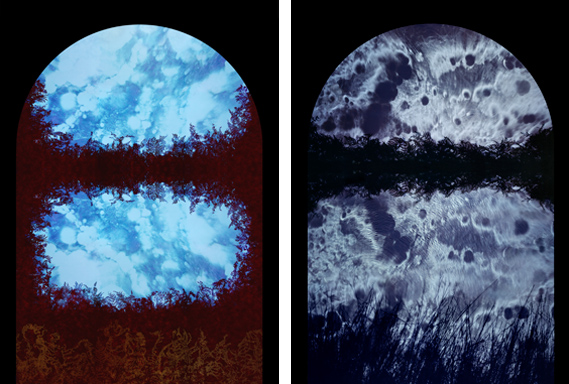
Arch (2007/08) by Susan Derges blends photograms of plants and scans of ink falling through water.
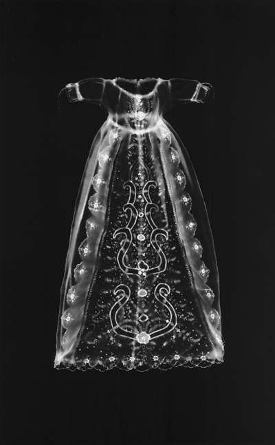


Christening Dress from My Ghosts (1997) by Adam Fuss


Anna Atkins Algae Cyanotype


Lastly there's a really good link here describing the cyanotype process.

Monday 30 May 2011

Research: Polaroid

Need to use half-term constructively and start cracking on with alternative images for this fantasy landscape project. Won a Polaroid camera on ebay this afternoon, £20 with unused film, not a bad price considering 600 film costs about £20 anyway. Have been merrily googling for creative ways to use this format. Fun little video here which shows one, albeit somewhat limited, use.


these use the new Impossible Project film which I love...
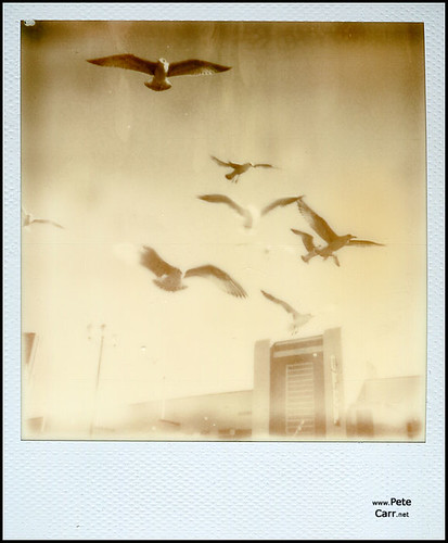
Polaroid - II

Impossible Film - I

This one, I assume, is shot through glass... not sure whether the wiggly lines were added after or not...

polaroid

Monday 23 May 2011

Development: Quick update

Still playing - but conscious I should be making more concrete decisions now. Spent yesterday afternoon taking some more photocopies of flowers - had a single rose in the garden and it was rather lovely so wanted to capture it... of course I then left it on the scanner bed and completely forgot about it so not quite so lovely this morning! Wanted to situate the feet in some way so took a shot of my bath from above. Slightly tricky as my balance is terrible and the process required a steady hand. Have also been thinking of a way of tying these ideas together in order to give the whole thing a sense of purpose... Have found a poem by Edgar Allan Poe which I think might suffice...

It was many and many a year ago,

In a kingdom by the sea,

That a maiden there lived whom you may know

By the name of Annabel Lee;

And this maiden she lived with no other thought

Than to love and be loved by me.

I was a child and she was a child,

In this kingdom by the sea;

But we loved with a love that was more than love-

I and my Annabel Lee;

With a love that the winged seraphs of heaven

Coveted her and me.

And this was the reason that, long ago,

In this kingdom by the sea,

A wind blew out of a cloud, chilling

My beautiful Annabel Lee;

So that her highborn kinsman came

And bore her away from me,

To shut her up in a sepulchre

In this kingdom by the sea.

The angels, not half so happy in heaven,

Went envying her and me-

Yes!- that was the reason (as all men know,

In this kingdom by the sea)

That the wind came out of the cloud by night,

Chilling and killing my Annabel Lee.

But our love it was stronger by far than the love

Of those who were older than we-

Of many far wiser than we-

And neither the angels in heaven above,

Nor the demons down under the sea,

Can ever dissever my soul from the soul

Of the beautiful Annabel Lee.

For the moon never beams without bringing me dreams

Of the beautiful Annabel Lee;

And the stars never rise but I feel the bright eyes

Of the beautiful Annabel Lee;

And so, all the night-tide, I lie down by the side

Of my darling- my darling- my life and my bride,

In the sepulchre there by the sea,

In her tomb by the sounding sea.


the sea is the bath water, the bath the tomb, the maiden - feet, love symbolised by the rose, will scoop some feathers off the lawn for the angels (our cat is ever obliging) clouds, stars etc still to decide. Wanted to incorporate text in some way so this seems an ideal way to do it - just need to decide upon the how. Anyway this is where I am ... the shadows are still troubling me and need to fine tune where the water meets the bath... work in progress I guess - watch me abandon it last minute and do something completely different!


Sunday 15 May 2011

Experimentation: More Layering

Having a quiet weekend, other half working, so I've carried on fiddling! Started with the basic blurry feet shot and added a watery layer. This is way more subtle than yesterdays efforts, I felt it needed to be less busy if I wanted to add flowers to it. Unfortunately the images I took yesterday don't really work but posting this anyway as it's a work in progress and demonstrates the problems I'm having quite nicely! I took the flower shots with flash ( feet were taken using natural light) and the colours are just too brash - didn't desaturate well either. I didn't bother finishing as I knew I'd have to re-shoot the flowers. Was quite happy with the effect of the shadows: used the lasso tool to cut out and tweaked using 'refine edge' in order to create a nice blurry shadow that wouldn't require too much tweaking when pasted. Touched up any rogue areas with the eraser tool, changing opacity where necessary. I then changed the refine edge settings on the flower to give me a crisper edge and added as a new layer. Decided I would need to re-shoot the flowers using deeper water (theory being the feet are under water so I need more depth for accurate shadows) but then found with the water deeper the shadows are miles away and don't have quite the same nice effect! Realism/artistic license dilemma beckons! Shall have a play and see what happens...


Saturday 14 May 2011

Experimentation: Playing with Layers

Really like images that are quite distorted, blurry and out of focus... remind me why I'm bothering to do a photography course! Took this one the other day - not particularly complicated just feet ceilingwards and snap at a slow shutter speed whilst moving... rather liked the effect though and thought I would have a play with it. Used the TTV image I took in Perry Wood the other week and just added it as a new layer. Desaturated and tweaked to achieve subtle detail. Never one to leave anything alone I then decided to add water (that would be the Hockney swimming pool influence!) Took another shot of my feet in water and applied this as a new layer... bit of a faff as was difficult to achieve the level of detail I wanted in the water without completely losing the detail in the feet... also lightenend it up a bit as the final result seemed a little dark. Was initially planning to add my copier flowers (have bunged these on flickr - link to the right of this post) and also took images of the flowers in water to check shadows but seemed a bit busy so discarded... may well revisit this later!


College Session: Out and About 10th May

Finally broke free of the studio and had a wander around Pitchcroft... looking for inspiration! Bit of a slow start but fortunately had a prop and my TTV kit with me so started with this...


like it as it is really so no plans to tweak at all. Spent the rest of the time snapping elements of the landscape that I could see myself recycling...


The drainpipe was three seperate photos that I stitched together in photoshop. I think I could use this with some of the tree images I snapped in Perry Wood. I already have a window that I was planning to paste in in order to create something along the lines of Enid Blyton's Faraway Tree.

The window just screamed Hockney'esque' swimming pool. I quite like the idea of rotating it landscape and cloning the brickwork to create a clean tiled effect.

The path also has potential, I have a nice HDR image of Perry Wood that this would work with.

Lots of ideas but still unwilling to commit!

Monday 9 May 2011

Artist Study: Show me the Monet


In order to meet certain criteria for this course we are expected to look at other artists and try and work out the processes/techniques used to produce their work... well this evening I watched the first episode in a new series 'Show me the Monet' and saw a picture that I loved, and definitely has photographic elements, but am completely stumped as to how she did it! On the plus side the 'experts' were similarly stumped! I can see how a similar effect could be achieved by using layers in photoshop but this lady is a fine artist so I'm pretty sure photoshop isn't involved. It's rather difficult to see the detail in the screen grab but if anyone has any ideas then throw them my way! You can watch the programme on bbc iplayer here and see more of her work here.

Wednesday 4 May 2011

Experimentation: TTV photography

Had the afternoon off so decided to skip the evening session at college and take some photos out in the real world. The last project was very studio centered so really want to get out and about for this one. I'd dabbled in TTV (Through the Viewfinder ) photography some time ago - but didn't really get much further than purchasing an appropriate vintage camera and constructing a device to hold it in. Because the brief for this assignment requires us to experiment I thought it an ideal opportunity to pick it up again. Didn't have a lot of time as I knew if I wandered too far I'd lose the light so kept local and had a wander up to Perry Wood (note to self: let Hannah know it's full of bikers doing stunts!). Had a few issues, the method is a little clunky and if the whole contraption isn't kept completely square you end up with shadows across the lens... added to this the original contraption was tailor made for a different camera so the focusing distance was slightly off and I did have a few issues with light leaking in. On the whole not unhappy with the results though. You kind of expect a slightly soft focus (see links to people far better than I!) and the imperfections are all part of the charm - at least I think so!


Links for more info
Sharon Rose
TTV Pete
Summersound Photography
Flickr TTV Photography group

Tuesday 26 April 2011

Experimentation: Copier Fun

Ok... so I have absolutely no idea how I'm going to incorporate this stuff in my final piece - having far too much fun with it to worry about such trivial things! Enjoying just experimenting... had no idea my photocopier would ever prove to be such a worthwhile investment! (Incidentally I tend to just bung most of my images on flickr so use the link on the right hand side of the page to access the rest!)


Monday 25 April 2011

Research: Copy Art

Last session I had a play on the photocopier with Susan. Using the HDR image I produced last week I utilised various techniques in order to create new images: enlarged small details, scrunched up a copy and rescanned, rotated whilst scanning (which resulted in a skate ramp!) and finally got silly with head shots and hands. Produced some really interesting results - certainly one of the head/hand images would work well if pasted into a confined space (think genie in a bottle type scenario). Tried emailing some of these images directly to Mark but he hasn't forwarded them yet so not sure whether they found their destination or not! Will post them if they turn up (alternatively could always just photograph them) Did a bit of googling on photocopy art and stumbled across a few interesting artists: have posted links and a couple of images below. Really interested in the work of Helen Chadwick (used her body a lot) but was unable to find any really good images online - will try the college library to see if they have any of her books. Also liked Thomas Eisner's Fanciful Designs - could incorporate his technique of placing objects on the glass in order to create elements for my landscape (if you follow the link you can see quite a few of his images where he creates birds etc out of found objects)

Helen Chadwick 'Of Mutability'


Thomas Eisner's Fanciful Designs


bit more info on the history of copy art here (Copy This! A Historical Perspective On the Use of
the Photocopier in Art by John A. Walker)

Monday 4 April 2011

Experimentation: HDR (I don't have a clue what I'm doing...)

Weather was lovely last weekend so had a wander up the river and took a few snaps. Basically looking for some potential material for the fantasy landscape project. On one of the 'pub-stops' I bumped into a guy who offered me a copy of Photomatix Pro ( seem to be doing well with the freebies!) obviously it would have been churlish to refuse! Picked it up the other day and have had a brief play with it... hence the title 'I don't have a clue what I'm doing' There is a help file but help files are usually rubbish so I don't tend to bother with them... so these are my first attempts!


The first image is as shot and was one of four shot at different exposures. I imported these into Photomatix and the result is image 2. Tried the automate HDR process in CS4 (by means of comparison) and it didn't align the images correctly so gave up... am sure this is me and CS4 is capable of better! Final image I just took a single RAW image and underexposed by one stop, then 2 stops, then one above and then two above. Saved the resulting .jpgs and then imported into Photomatix. This seems a little more subtle. As first attempts I'm quite happy with the results. Certainly potential with this: really liked the stone pillars in the second image and can see how used in a more subtle way it can be quite effective. I still hate the full-on garish HDR effect though... Obviously need to play with this some more!

Sunday 27 March 2011

Research - Fantasy Landscapes
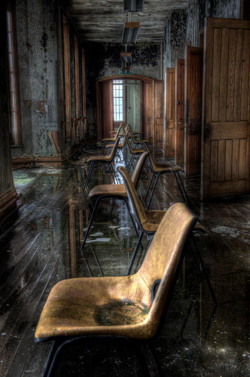


Steve pointed me in the direction of this one. Am, assuming the images on this site are mostly HDR? Not a huge fan of HDR to be honest (keep meaning to have a dabble but never seem to get around to it!) but I think in this context it works really well, certainly could see it working in a fantasy landscape. Anyway there's a reason Steve sent me the link, last session we were discussing urban exploration. It's something I've always wanted to do but never had the nerve (mainly because it seems to involve breaking and entering and I doubt a criminal record would do much for my teaching career!) Sue jestingly suggested we find a site and pretend to be buyers, cracking idea but not sure that's the point! Did have a tenuous google and identified a couple of potential sites but may have to find a legal way of getting in... Am an avid follower of the exploits of others though and 28 days later has to be my favourite website ever. I love the post apocalyptic feel of the images but the best are those that contrast this with an incongruous element: splashes of colour, a crisp packet... something that doesn't belong...


Initial Research: Fantasy Landscapes


We've been given our new brief and really excited by this one! Basically we have to produce a montage of images and use them to create a fantasy landscape. Instantly thought of multimedia artist Dave McKean ( good article here) I've probably mentioned him several times in my hard copy sketch book but am a huge fan! He uses mixed media: newspaper, photographs, drawings etc and I love the way he combines these to create distorted, slightly disturbing, images. Really enjoy working with photoshop but would love to go old school with this one. Not sure about the 'how' (ever practical!) but have a vague idea of what I'd like to do. Am thinking of using polaroids of random objects to create a new image, transferring images to acetate and layering, transferring images onto three dimensional objects. Want to cut up negatives and prints and use newspaper and twigs and glue...