Tuesday 6 March 2012

Web Images

How is it March already? Have been in and out of hospital since the beginning of January so that has taken out the first part of this year... but I have no idea where the second half of last year got to! Am signed off work for at least another two weeks and if things don't improve maybe longer... all a bit wait and see. Anyway am getting twitchy so starting to tie up loose ends - one of which was producing a disc of web images for Maggs. Rather a laborious task, hence the leaving it so long, but had been given a gentle nudge so felt obligated to get my proverbial butt in gear...

So the process bit. Initially I tried creating an action in CS4 to batch edit the images but ran into problems. Firstly it dumped them in the wrong folder and then it didn't name them correctly, I wanted them saved as jpegs but 'it' kept saving as psd, eventually concluded it would be quicker to edit individually. Created a watermark using the logo my brother designed for me and added this to each image as a seperate layer, tweaked the opacity, changed the dpi to 72 and saved as jpeg quality 5. Really really boring and took me ages so I guess I need to prioritise learning to create actions!

Then the fun bit. Copied the files to cd but the only cds I had are printable (twice as expensive) ones. Decided I may as well look professional and print a label. For this I used cd label print software: which 'I think' came with the printer. Utilised a free graphic off the net (film cannister) inserted a couple of my images and ditched the ilford branding (stuck my logo in its place) to personalise it a bit. Not particularly time consuming and a whole lot more fun! Could also re-use this at a later date so probably worth playing with now. Hit print and followed the on-screen instructions. Thankfully simple - I knew there was a reason I spent a silly amount of money on this printer!
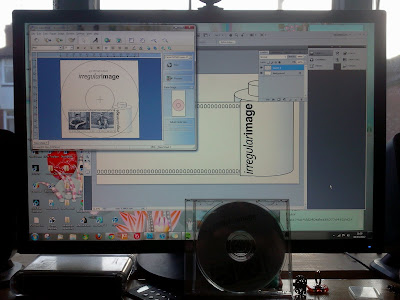
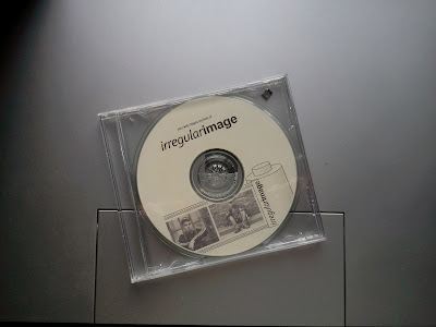


Plan of Action...

So what next? I think my priority at the moment is to utilise the spare time I have wisely! Finally ventured into college for a morning last week and am about ready to take the test for the MS Word module. Would really like to do the web design module next and get cracking with a new web site. Let the last one disappear, didn't renew the domain name, and registered a new domain name ages ago. Will need to sort out hosting (unless my brother wants to let me steal some of his space again!) and start sifting through all my images for material to put on it. I may be some time....!!!!!!!


Thursday 25 August 2011

I'm a photographer...

Bit of a catch up post as haven't found the time (it's the summer holidays.. I've been busy!) to sit at my computer and blog. Received my results, I got a distinction, collected my portfolio and have propped it up against a wall to gather dust... Feel a little sad that it's all over and am now eager to embark upon a new adventure: I have the learning bug and don't think I will ever be free of it! Took some photos for the Magg's Day Centre the other day. Was a very scary experience but have learnt so much from it. Had to produce a poster to attract subjects and model release form to put things on a more official standing. These things take time and I think in the future I will have to start figuring these in the costings! Spent the day prior to the shoot taking test shots and working out good locations, weather was lovely and came away full of inspiration. Day of shoot arrived, typically overcast and weather forecast ominous, subjects didn't want to venture further than the front door! Felt a little nervous to start with but soon put this aside and just enjoyed having a natter. I think I would have struggled if I'd been alone, was good to have an extra pair of hands when it came to getting forms signed and thinking on the hop about how I could make one location look like several different ones! Also the subjects were not of the sit and pose for multiple shots variety... Took two shots max of each subject (and second one was often given grudgingly!) thank god it was drilled into us on our course to think and compose before firing the shutter - I didn't get any second chances! Was aware from the outset that the client wanted a particular look for the images and tried to accomodate this but think I probably snuck a bit of me in there too! I'm not sure I'll always be able to equate what I want to achieve with client demands! Sticking one guy behind iron railings felt wrong to me, client liked this one, getting them to smile felt right! Read an interesting article published by jpeg magazine which offers advice to aspiring photographers. Couple of things I took from it: firstly learn to say no if a job doesn't fit you, I think this one did - I like portraits and love B&W but the one I've just been offered doesn't and secondly learn to say "I'm a photographer" out loud with a straight face! Read the article you'll understand!


Saturday 25 June 2011

Conclusion: Assignment Reflection

Of all the assignments I feel this one really suited me the most. Will dwell on the positives first! This assignment brief really encouraged me to break free of photoshop and look at creating images using a more hands-on approach. I like using photoshop, have continued to use it for the duration, but I really wanted to try creating artistic imagery without it. Because I utilised film cameras leading up to the 'Time' Project I wanted to branch off in a different direction for this assignment. I was aware that the assignment brief demanded a certain amount of darkroom experimentation but in order to make the most of this experience I didn't want to repeat methods I had already explored. During lessons I was able to play with pinhole cameras (mixed results!) and paint with tints. I had a lot of fun with the photocopier and this featured very strongly in my final images for this project: the roses and hand-written text in the bath image, the pouring water in the portrait. I also looked at methods I could easily play with off site. I produced a series of images using a Polaroid camera and out of date film and many images using light sensitive paper. I also created digital negatives from some of my images and used these to create contact prints, both on light sensitive paper and in the darkroom. I did re-visit some techniques I had used before: TTV photography and in-camera techniques such as slow shutter speeds to create blur. On to the negatives... If I'm honest I'm not entirely sure that the images I produced are that great! I had a lot of fun during the process but I don't look at any of them and feel any particular sense of satisfaction. For me this assignment has been more about experimenting and looking at different ways of producing images, it has encouraged me to move outside of my comfort zone and go a little wild - from that perspective I am really happy! Would I change anything? absolutely not. I feel I managed to explore quite a few new techniques in a very short amount of time. I also feel that these are techniques I would use again. I think after my inital elation at the prospect of a project with such an inviting title 'fantasy landscapes' I went through a slightly despondent phase when I realised everyone else seemed to interpret that as meaning cut and paste in photoshop... I started this course because I found myself using photoshop way too much! I think I may have stretched the brief in some regards, few of my images are landscapes, but they are fantastical in that nothing in them is real... am very pleased that in the main I managed to create this using a camera,scanner or processing and not software!

Experimentation: Darkroom prints from digital negatives

Last practical evening at college so took the opportunity to use the darkroom one last time. Thought it would be interesting to see the results of contact prints made from the digital negatives I had created. Have already recorded the actual process of creating contact prints in my sketch books so won't bother regurgitating that here, also put the best prints straight into my portfolio (handed in for assessment) so unable to upload the best results! Happiest with the feather image because the texture in the image really came across, less pleased with the portrait as I felt a lot of the detail was lost - interesting that this seemed to work much better with the contact print using light sensitive paper.


Monday 13 June 2011

Experimentation: Polaroid triptychs

Finally got around to testing the out of date film (exp: Jan 2005) that I got with my Polaroid camera. Worked surprisingly well! Was half expecting the developer to fail and to end up with half-developed prints (on reflection I would have quite liked it if it had!) but the only real issue was the noticeable colour cast and slight lack of contrast. Decided not to alter this in photoshop as the overall effect is quite distinctive and totally in keeping with the format. I did try scratching one of the images, read a lot about manipulating images as the emulsion was drying, but the results were unimpressive. I think this would work better with images that have a broader colour range. Scanning added its own complications as this resulted in overly bright yellow prints... tried to capture the original look as much as possible but I def' have issues with my monitor (never calibrate yourself you'll only make matters worse!) and am now convinced they have a rather unsavoury green cast to them. Anyway these are the results, have ordered a couple of prints to see what they look like...

I took the first two images in this set and my other half took the one of me (hence lopping off my feet and rather nice shadow!) Quite like the fact that the one sits slightly lower in the frame so have duly forgiven him...


This one was a mistake! I took the chair image and flipped it to create a wallpaper background to set off the polaroids. Then, whilst tidying up the polaroid frame, accidentally deleted the central image. Rather liked it so saved as a seperate file.


Because the actual polaroid image is quite small I decided to present them as triptychs. Think they work quite nicely in threes. In this last one I tried to tell a bit of a story... kind of self explanatory - plastic poundland bunny gets noshed by fake fur critter!


Tuesday 7 June 2011

Experimentation: Cyanotypes from Digital Negatives

Had half an hour to kill when I got back from work today so thought I'd make the most of the momentary sunshine and quickly develop some prints from the digital negatives I made the other day. Same process as before. Stored the sun-print paper in my changing bag, until I was ready to use it, then placed a digital negative directly onto the surface. Placed a piece of perspex on top to keep the image in place and left for 2 minutes (not quite as sunny!) to expose. I then removed the negative and placed the sun-paper in a bowl of water. Transferred to a towel to dry. Am really surprised at how well these came out! There was a lot more detail in the figures than I was expecting. Now I just need to work out how I'm actually going to utilise this technique in a fantasy landscape image..


Sunday 5 June 2011

Experimentation: Digital Negatives

To make my own digital negatives I ‘followed’ the instructions given on this site. I selected four of the images I have been working on recently, converted to black and white and then tweaked the settings slightly to maximise contrast. I then used the invert tool to achieve a negative image. Found the print settings on my printer somewhat difficult to negotiate – certainly share no similarities with the settings given on the website. Did my best to select the correct options: increase density etc then printed onto inkjet transparency film. Looking at the results I suspect the feather will work best as a contact print. I’ve been unable to test this out yet as typically the weather is now overcast and cloudy so I have no sunlight to develop with! Back to work tomorrow, so playtime is essentially over, and I still don’t have an image I’m entirely happy with… starting to feel somewhat gloomy about this project again… would be nice to finish on a high!