Tuesday, 26 April 2011

Experimentation: Copier Fun

Ok... so I have absolutely no idea how I'm going to incorporate this stuff in my final piece - having far too much fun with it to worry about such trivial things! Enjoying just experimenting... had no idea my photocopier would ever prove to be such a worthwhile investment! (Incidentally I tend to just bung most of my images on flickr so use the link on the right hand side of the page to access the rest!)


Monday, 25 April 2011

Research: Copy Art

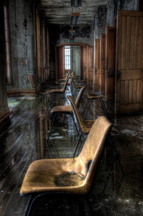
Last session I had a play on the photocopier with Susan. Using the HDR image I produced last week I utilised various techniques in order to create new images: enlarged small details, scrunched up a copy and rescanned, rotated whilst scanning (which resulted in a skate ramp!) and finally got silly with head shots and hands. Produced some really interesting results - certainly one of the head/hand images would work well if pasted into a confined space (think genie in a bottle type scenario). Tried emailing some of these images directly to Mark but he hasn't forwarded them yet so not sure whether they found their destination or not! Will post them if they turn up (alternatively could always just photograph them) Did a bit of googling on photocopy art and stumbled across a few interesting artists: have posted links and a couple of images below. Really interested in the work of Helen Chadwick (used her body a lot) but was unable to find any really good images online - will try the college library to see if they have any of her books. Also liked Thomas Eisner's Fanciful Designs - could incorporate his technique of placing objects on the glass in order to create elements for my landscape (if you follow the link you can see quite a few of his images where he creates birds etc out of found objects)

Helen Chadwick 'Of Mutability'


Thomas Eisner's Fanciful Designs


bit more info on the history of copy art here (Copy This! A Historical Perspective On the Use of
the Photocopier in Art by John A. Walker)

Monday, 4 April 2011

Experimentation: HDR (I don't have a clue what I'm doing...)

Weather was lovely last weekend so had a wander up the river and took a few snaps. Basically looking for some potential material for the fantasy landscape project. On one of the 'pub-stops' I bumped into a guy who offered me a copy of Photomatix Pro ( seem to be doing well with the freebies!) obviously it would have been churlish to refuse! Picked it up the other day and have had a brief play with it... hence the title 'I don't have a clue what I'm doing' There is a help file but help files are usually rubbish so I don't tend to bother with them... so these are my first attempts!


The first image is as shot and was one of four shot at different exposures. I imported these into Photomatix and the result is image 2. Tried the automate HDR process in CS4 (by means of comparison) and it didn't align the images correctly so gave up... am sure this is me and CS4 is capable of better! Final image I just took a single RAW image and underexposed by one stop, then 2 stops, then one above and then two above. Saved the resulting .jpgs and then imported into Photomatix. This seems a little more subtle. As first attempts I'm quite happy with the results. Certainly potential with this: really liked the stone pillars in the second image and can see how used in a more subtle way it can be quite effective. I still hate the full-on garish HDR effect though... Obviously need to play with this some more!

Sunday, 27 March 2011

Research - Fantasy Landscapes


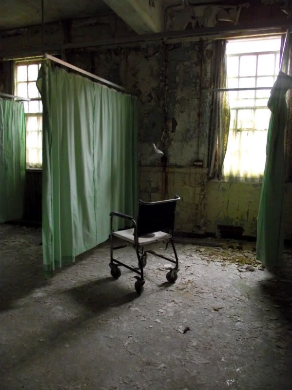
Steve pointed me in the direction of this one. Am, assuming the images on this site are mostly HDR? Not a huge fan of HDR to be honest (keep meaning to have a dabble but never seem to get around to it!) but I think in this context it works really well, certainly could see it working in a fantasy landscape. Anyway there's a reason Steve sent me the link, last session we were discussing urban exploration. It's something I've always wanted to do but never had the nerve (mainly because it seems to involve breaking and entering and I doubt a criminal record would do much for my teaching career!) Sue jestingly suggested we find a site and pretend to be buyers, cracking idea but not sure that's the point! Did have a tenuous google and identified a couple of potential sites but may have to find a legal way of getting in... Am an avid follower of the exploits of others though and 28 days later has to be my favourite website ever. I love the post apocalyptic feel of the images but the best are those that contrast this with an incongruous element: splashes of colour, a crisp packet... something that doesn't belong...


Initial Research: Fantasy Landscapes


We've been given our new brief and really excited by this one! Basically we have to produce a montage of images and use them to create a fantasy landscape. Instantly thought of multimedia artist Dave McKean ( good article here) I've probably mentioned him several times in my hard copy sketch book but am a huge fan! He uses mixed media: newspaper, photographs, drawings etc and I love the way he combines these to create distorted, slightly disturbing, images. Really enjoy working with photoshop but would love to go old school with this one. Not sure about the 'how' (ever practical!) but have a vague idea of what I'd like to do. Am thinking of using polaroids of random objects to create a new image, transferring images to acetate and layering, transferring images onto three dimensional objects. Want to cut up negatives and prints and use newspaper and twigs and glue...

Monday, 14 March 2011

Final Images for Magazine

Hand-in deadline tomorrow so had to be strict with myself and crack on. Decided to settle for what I had with the DPS and cover, I think I could have carried on tweaking forever! Editorial page has now been majorly re-vamped. I revisited my original images a week or so ago and had a play with one that I had discarded, didn't like as shot, but really liked when coverted to hi-key B&W. Liked it so much I wanted to use it but when I dropped it into the template with the other images found it didn't really work... had a bit of a dilemma over whether to ditch it, the simple answer, or whether to go B&W with all the others, the complicated one... no prizes for guessing which I opted for! Meant a bit of additional shooting as I thought I may as well go the 'whole hog' if I was going B&W. Took a shot of the ilford film I had processed earlier on in the course and used this to frame the shot of the umbrella (layers) decided I rather liked the grungy effect of the watermarks so purposefully chose the worst affected and left them in. Had some issues with size (image ratios were pre-determined so had to make my film cell fit!) and was a little unsure of the result but feedback was positive so went with it. Also took a shot of the ties (was initially planning to shoot these with a model wearing the hand glasses) as they were black and white anyway and I knew would work as one of the really tiny images. Lots of playing around in Publisher: had issues with matching my greys (where the heck did my eye dropper tool vanish to?) and toyed with the idea of using a texture as a background (was vetoed as 'naff'!) Found a great site for free textures which I shall no doubt find a use for at a later date - working on developing a bank of my own but nice to have access to more. Feel a little disappointed that the image sizes don't really allow me to show them off - they look so much better viewed big! Also feel that this assignment ended being less about picture quality and more about making the images work in relation to each other. Spent a lot of time considering framing but ultimately ditched some of my best images because they didn't work well enough with the others... On the plus side I did it! Was convinced this one was too big for me...

Tuesday, 8 March 2011

Fonts

Ok have sussed out why I was losing the end of the title, tried a different font and issue corrected, suspect there is a restriction on size. Still feel a million miles away from what I want. Not happy with the different greys in the images - think I need to re-process and make sure I have used the same settings. Also pondering putting a border on - initially planned to use a shot of a film negative. Anything else? Oh yeah - the black background makes the black t-shirt look grey... so hard to judge all this stuff when your monitor isn't calibrated properly! Need to make some decisions pretty quickly because I need to print!