 This could go on indefinitely! Imported the recycling .gif into CS4, used the magic wand to select the white, deleted it then saved as a .png in order to preserve transparency. Googled for some design tips and stumbled across MagForum so beginning to develop an awareness of design. Still struggling with the white text as it loses clarity where it crosses the skin and grey background... have experimented with alternative colour schemes but keep reverting to black, red, white. Downloaded a few more fonts from MadTuts and had a play with the Masthead. Liking this one better and have added a selling line 'The UK's Best Selling Ethical Fashion Magazine'. Still more tweaking to be done but really need to start considering the editorial and double-page spread... more pictures to take as well!
Thursday, 17 February 2011
More Tweaking..
This could go on indefinitely! Imported the recycling .gif into CS4, used the magic wand to select the white, deleted it then saved as a .png in order to preserve transparency. Googled for some design tips and stumbled across MagForum so beginning to develop an awareness of design. Still struggling with the white text as it loses clarity where it crosses the skin and grey background... have experimented with alternative colour schemes but keep reverting to black, red, white. Downloaded a few more fonts from MadTuts and had a play with the Masthead. Liking this one better and have added a selling line 'The UK's Best Selling Ethical Fashion Magazine'. Still more tweaking to be done but really need to start considering the editorial and double-page spread... more pictures to take as well!Tuesday, 15 February 2011
Cover Design
 Preliminary mock-up of cover. Used the dropper tool to match the text with the lipstick. I know the pro's would sneer at publisher but it seems just fine for my purposes and at least allows me a degree of control. No time to play with illustrator at college and don't want to just use the supplied template. Have managed to find plenty of different fonts online and am still experimenting a little with these: certainly the font I've used for the first article needs replacing, like it but not very easy to read! Also need to change my recycling symbol to one with a transparent background - didn't realise it wasn't until I inserted my image and the symbol was no longer against white!
Scary shoot!
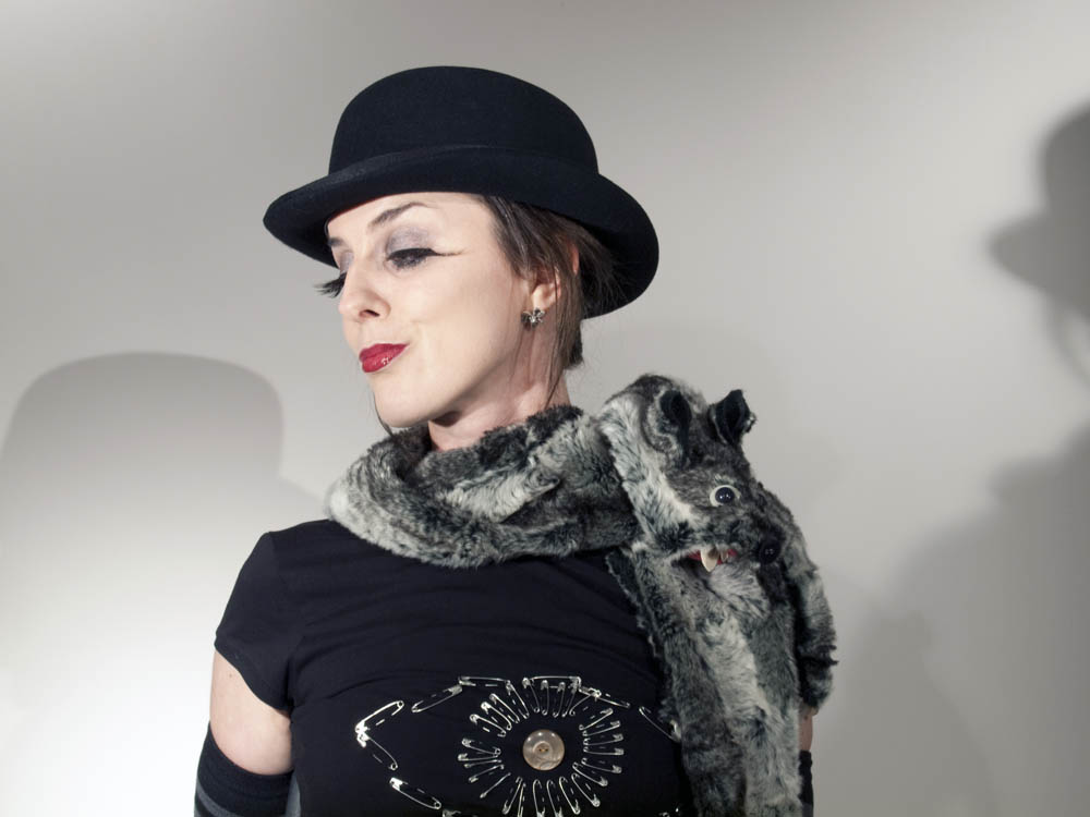
 Ok it's done - mixed results. Really felt the pressure with this one! Has taken up so much time designing, planning and creating the clothing, hair and make-up that I was terrified having only one shot to capture the images! Arrived early to help Aggie, who then modelled for me. Got the studio position I needed (after my previous experiment I knew I had to have a white backdrop) but still had to consider others working in the space - which meant I couldn't simply black-out the room, lock the shutter open and use flash to create the multiple exposure I would have liked. Also really struggled with my lens! Am a little obsessive about images being really sharp (unless I'm aiming for soft, blurry and OOF!) and my sharpest lens is a macro! Lovely for portrait shots but hideous for full body shots as I have to be virtually the other end of the room. An added difficulty is the viewfinder on my e620 is rubbish for judging focus at distance. Excuses excuses! Aggie made an amazing model - thick skinned enough to take lots of ordering about! Also made lots of helpful suggestions about the lighting and poses. Fished out an ancient light meter that my dad gave me, which actually did help in judging available lighting, but didn't have a clue how to use it! Mark gave me a quick lesson and Aggie and I compared results between this and the infinitely more modern electronic version! Was pretty much spot on so stuck with it but by the end of the evening think it had had enough because the needle stuck and refused to budge! May have to invest in a marginally less ancient one. Steve helped re-position the lights and also snapped me working - voila me using a light meter shocker!
 Really happy with the white card - after sussing out how to set the one step white balance on the function button it was very quick and easy to use. Of course that still didn't stop me reaching the point where having fiddled with the lighting for the fifteenth time, and being at the other end of the room, not bothering to set it again! Cue Mark walking in and instantly noticing my white balance was off! Anyway results below. Definitely have enough shots to work with but wouldn't say there is a single one I am completely happy with! Alot of the distance shots were soft (cue double page spread panic!) and not too sure about some of the shadows on the face. I do love the one with the critter on the hat as I think the shadow created by his claws are very clockwork orange - unfortunately the framing won't work as a cover shot.


Monday, 7 February 2011
Magazine Design Considerations
Had the afternoon off so thought I'd have a bit of a play in publisher - so glad I did. All sorts of things to consider when taking my final images tomorrow night! The position of the text (am assuming this isn't flexible so will need to clarify) really impacts on the framing of the image. Will definitely need to leave some space down the left hand side. Also need to think more about my colour scheme as my image is essentially black and white but the text will need to cross both: meaning black or white text won't work. Tried grey which wasn't too bad... am wary of colour as it can look tacky! Until I looked at magazine covers I didn't realise they use so many different fonts - initially opted for just two but after playing with it for a while thought multiple fonts actually worked better. Anyway first draft here (the image isn't mine - obviously - but represents my intended framing and colour)

magazine research

All very well doing this digitally but whilst I'm usually quite good with a graphics tablet for editing photos I've just discovered I can't ruddy draw with one! Anyway rough plan thinking of which image will go where..

Saturday, 5 February 2011
White Balance
Over the last couple of weeks I've been conscious of issues with white balance. I've tried using the automated settings and also selecting colour temperature but have been unhappy with the amount of images that show a distinctive colour cast. Whilst I recognise shooting in RAW means I can amend in post production the whole point of this course is to eliminate the need for anything I could/should be doing in camera! Obviously this week I neglected to set my camera to RAW mode so, had I been planning to use these images for my magazine, I'd have degraded image quality correcting them. Because it's been such an issue of late, and I'm totally daunted by the prospect of getting one opportunity to stage and shoot the images I need, I've been looking into this. 'Voila' Youtube vid' on white balance. Was aware that my camera had a custom white balance and vaguely remembered reading about setting it manually using grey card. Am unable, unwilling!, to splash the cash on fancy colour cards but have sucumbed to purchasing a Lastolite Ezybalance Grey/White card.... bit of a faff to set my camera up initially but got to be worth a try. Shall see how I get on with it.
Friday, 4 February 2011
Lighting Diagram Tool
Had an email from Steve telling me about a natty little site that allows you to create diagrams of your studio lighting. Rather a nice way to record it so thought I'd share (lighting essentials) Here is my set up from a test shoot this week... used continuous lighting not flash guns but couldn't find an appropriate image to represent that!


Subscribe to:
Comments (Atom)