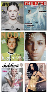
Had the afternoon off so thought I'd have a bit of a play in publisher - so glad I did. All sorts of things to consider when taking my final images tomorrow night! The position of the text (am assuming this isn't flexible so will need to clarify) really impacts on the framing of the image. Will definitely need to leave some space down the left hand side. Also need to think more about my colour scheme as my image is essentially black and white but the text will need to cross both: meaning black or white text won't work. Tried grey which wasn't too bad... am wary of colour as it can look tacky! Until I looked at magazine covers I didn't realise they use so many different fonts - initially opted for just two but after playing with it for a while thought multiple fonts actually worked better. Anyway first draft here (the image isn't mine - obviously - but represents my intended framing and colour)
magazine research


What a great way to document what you do! I love this idea! While some of the Studio members currently have their cameras all squared away (some of us have more than one), I'm about to take the plunge. I'll be sure to come by often to learn from those experiences you blog here.
ReplyDeleteRose McGuinn